Designing a Mobile App for Teachers to Support High Risk Students

Interaction Design |User research |information architecture | Concepting | wireframing | Graphic Design
RyeCatcher for mobile is the mobile version of the web platform, RyeCatcher, needs and high risk students. The RyeCatcher app acts as a task manager for busy teachers, social workers, and school administrators. This app makes the RyeCatcher process easy, quick, and simple for users. In creating this app, we have streamlined RyeCatcher data entry, allowing users to quickly do what they need to in a simple, straightforward process. Our final deliverables to our client include annotated wireframes, high fidelity screen mockups, and high resolution images which capture the key ideas of our solution. Over the course of this project, we also developed a project plan, a halfway point client presentation, a presentation regarding user testing results, and a process document.
Brief: RyeCatcher would like to explore possibilities for a mobile application that presents a subset of functionality from the existing web platform. It will be your job to determine the best way to translate functionality from the web application into the mobile context.
Client: RyeCatcher | With Hajira Qazi, Scott Dombkowski, and Vic Costykian | Carnegie Mellon University | Instructors: Raelynn O'Leary + Ashley Deal | Timeline: 6 weeks
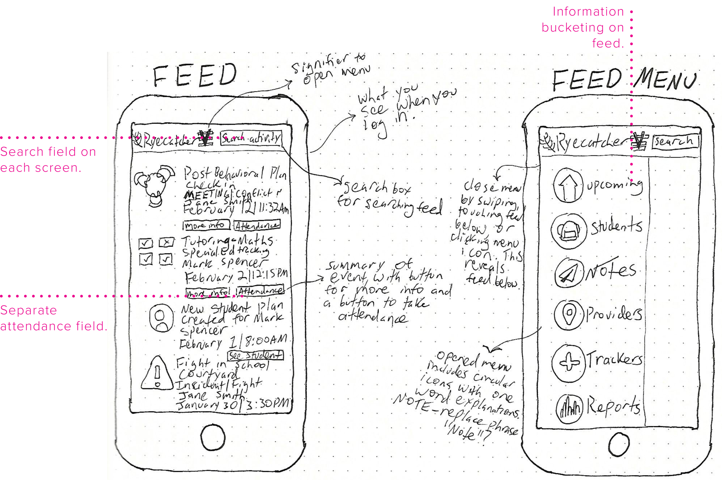
The Concept

How it works

Understanding the Problem
It is was our task to translate functionality from an existing web application and optimize features for use in a mobile context. The product, RyeCatcher, enables parents and student advocates to build and manage a “circle of support” tailored to a student’s individual needs. It also serves as a tool to connect students with local support providers, and facilitates tracking and monitoring student progress over time.
We learned from experts that teachers, support staff, and administrators are often so busy they don't fill out relevant data. They need a mobile app that takes the most useful features from the web platform and strips them down in a useable context. The app collects data about students to help keep track of their growth and needs to show schools where performance is good and where it is left wanting.
In essence, students need a lot of support, schools need data, and everyone needs an easy way to communicate with each other. With those factors in mind, we asked ourselves the following questions:
How might we....
Help teachers collect accurate data and track students' progress quickly and easily?
Make data clearer for both users and students about a students' progress?
Make a task manager that is both polite and helpful in order to encourage use?
Exploratory Research

We conducted 2 usability tests with a teacher and a social worker on the existing web platform as well as use the platform ourselves in order to identify pain points with the existing paradigm.
We identified major problem areas with feature creep, confusing labeling, and overall, too much information to contend with, especially in a mobile context.
Synthesis
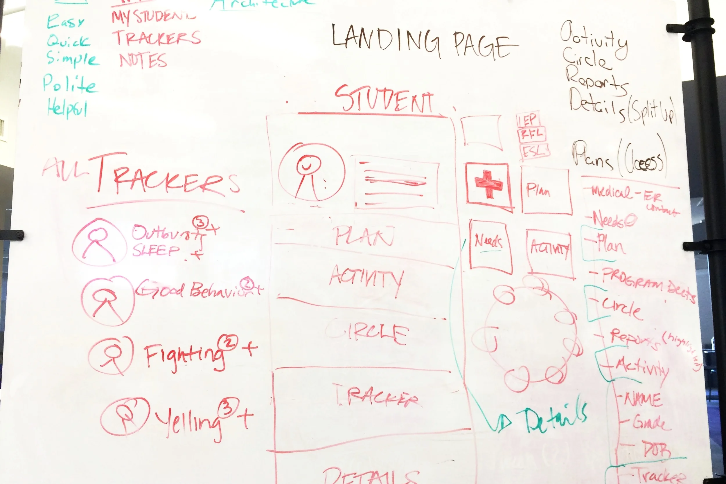
We co-sketched, brainstormed, and argued for and against different paint points that we saw as pertinent to the situation. We saw major issues with a feature called trackers, where students' specific behaviors are tracked, how an action was entered into the system, flaws with names, and unclear data visualizations. While we didn't reach consensus, we all went home and sketched our own solutions to see different possibilities for how we could attack the information architecture. What we did decide on were the following design principles:
Insight
We knew we needed to create a mobile app with the following principles in mind:
Simple and clear
Polite and helpful task management
Sensitive to time and workload
Uncluttered Information .
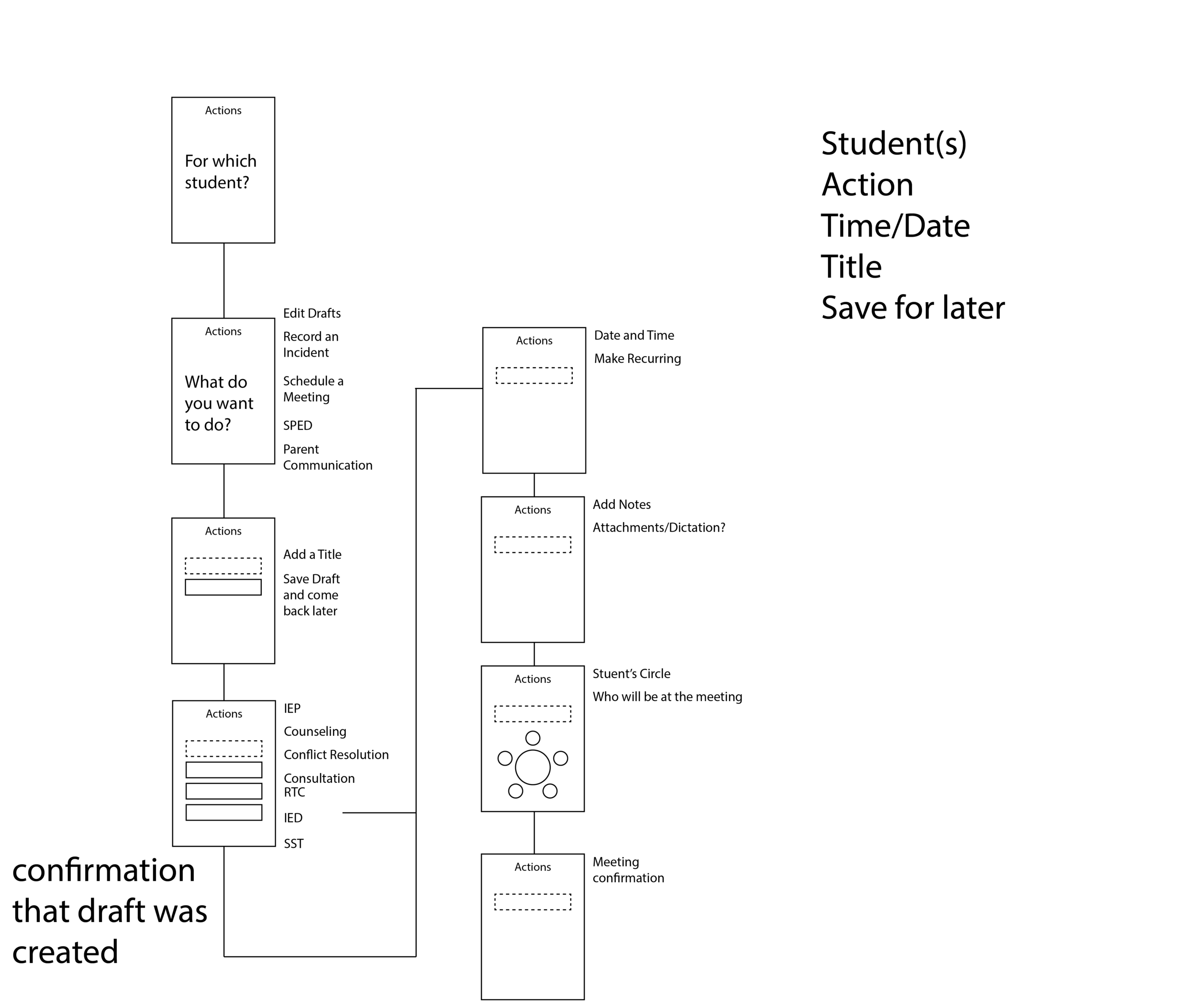
Ideation
Concept Development
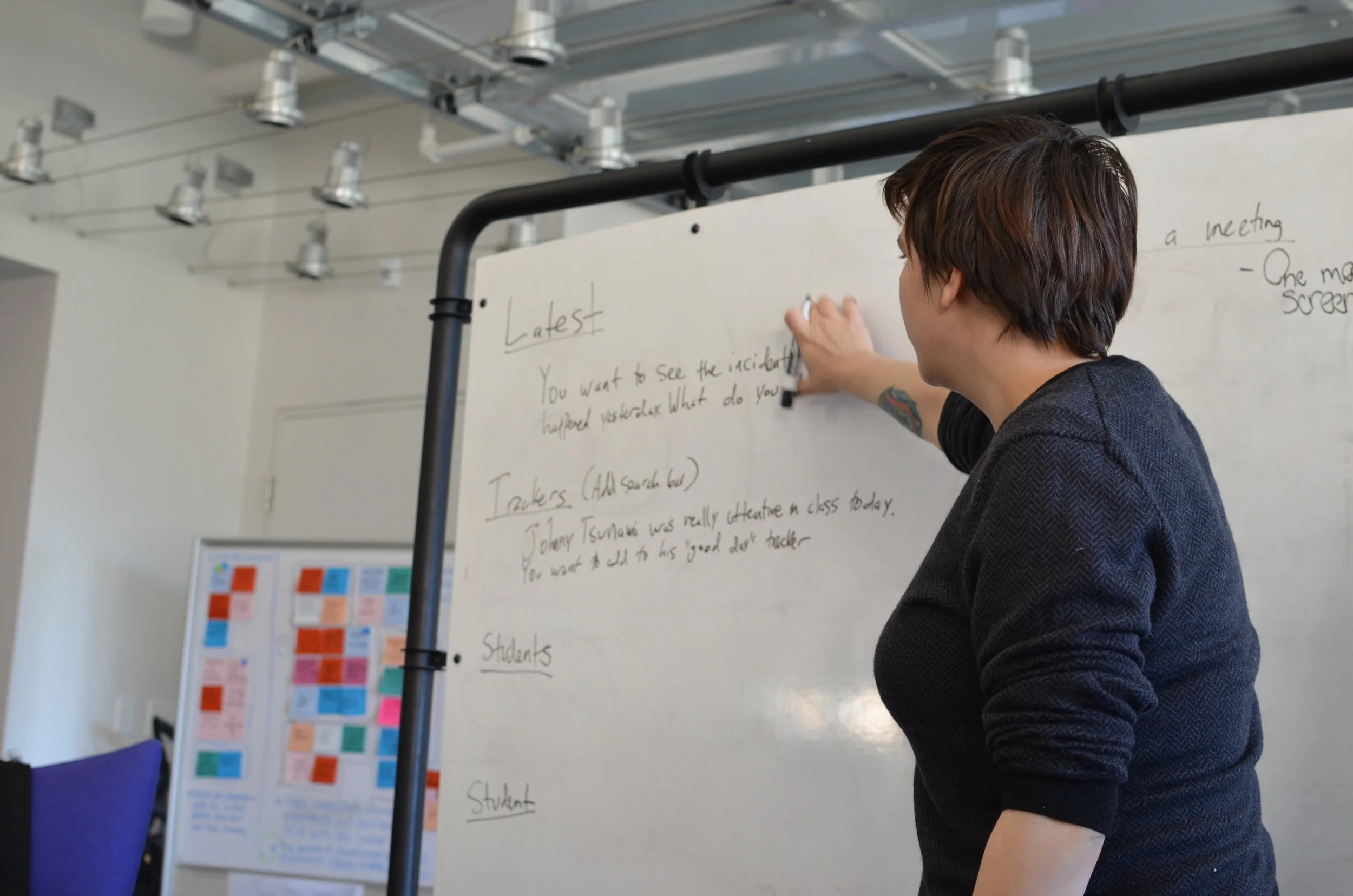
We all sketched individually after our initial brainstorming session to see how we could combine all our ideas into the final prototype. We culled the best ideas from all sketches into the final solution.

Addressing Specific Painpoints
Quicknotes
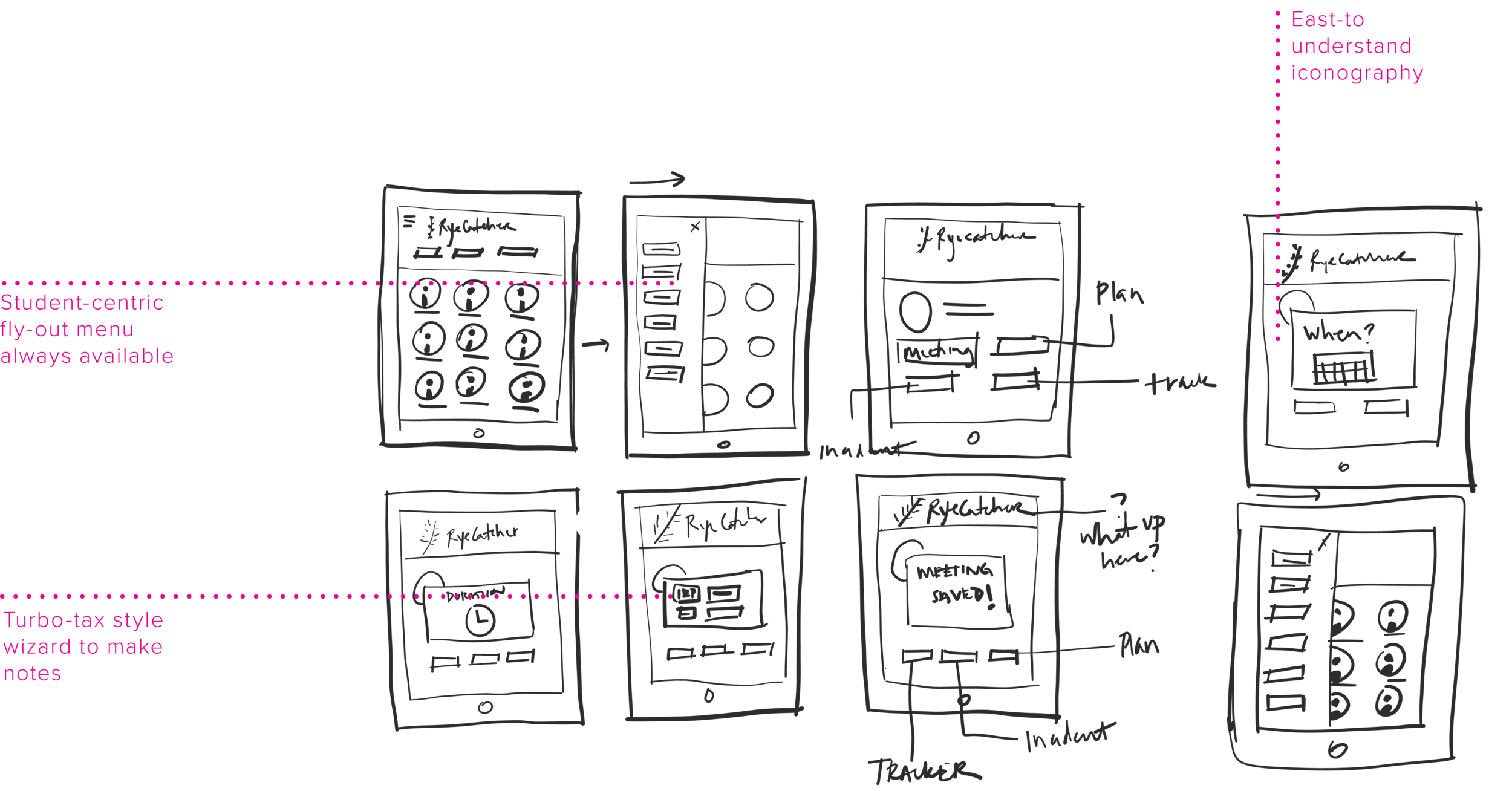
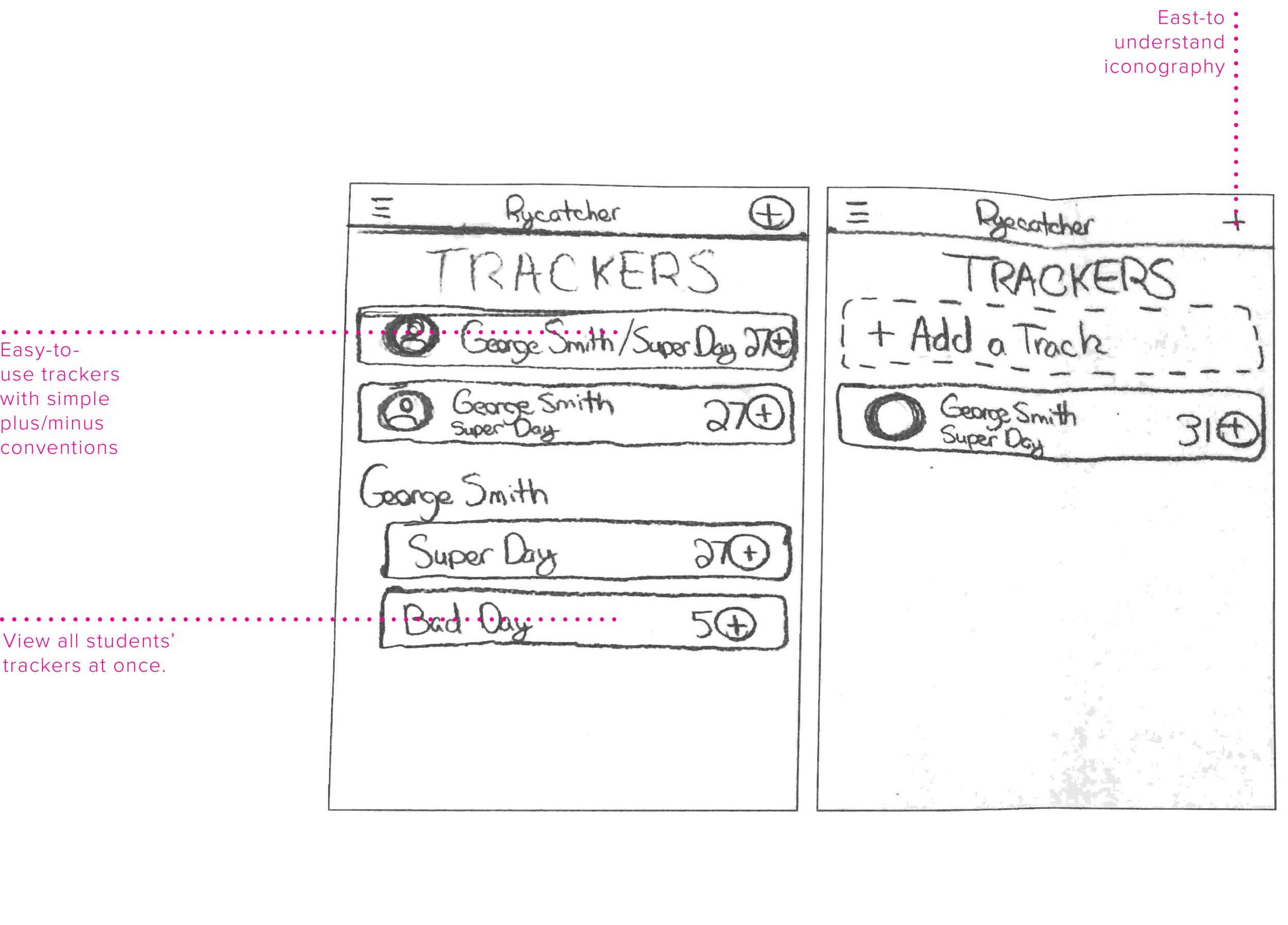
Drafts
Early Flows

Evaluative Research
Arthi's Feedback

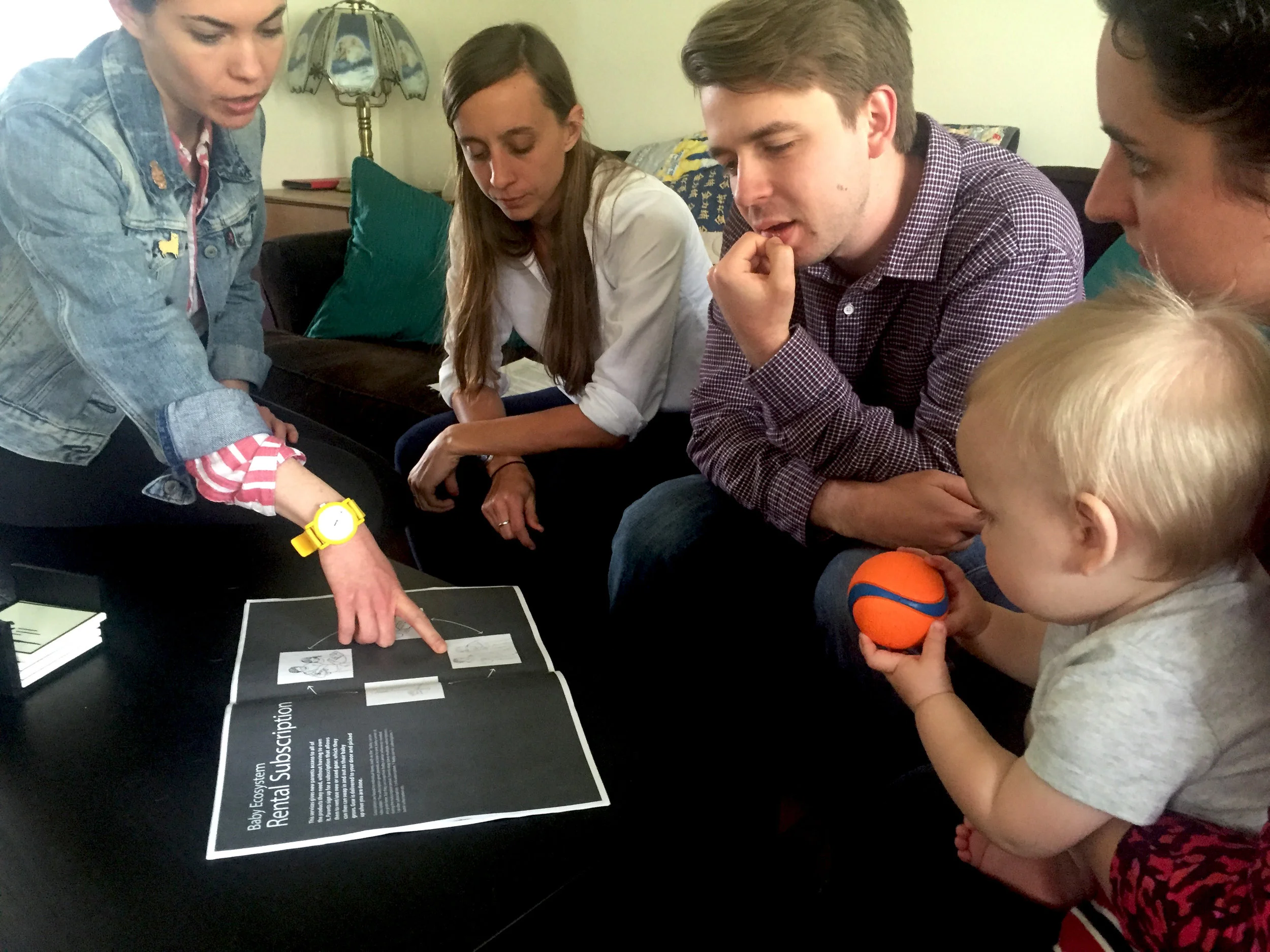
While we were hoping for a smoking gun that would point us in the correct direction, most of the feedback was all over the map. Most parents decided that the baby box rental system seemed like the most convenient idea, but we worried that parents said this because they were already familiar with box subscription services. All parents commented that "reimagining the baby shower" looked interesting and providing support was needed when their new baby was born. We also learned that new parents almost universally hate baby showers as they are. They don't like playing games, watching people open gifts, and they get items they don't want.
Trying to do it all
Initially, in an attempt to solve all of the pain points and create a service which would help all of the parents we spoke to, we sketched out an idea for a service that would combine a box subscription service, a rental service for big ticket items like strollers and baby carriers, a gift registry that would accommodate used items, and also a toolkit for having a supportive baby shower.
the baby shower is the root-cause
We quickly realized that combining a box-based rental service with a baby shower watered down all the concepts. They did not work elegantly together, and ultimately did not solve a problem. The babyshower was the lynchpin in a cascade of practices about gift giving that could be stopped in its tracks, and we felt it was the best and most elegant solution to reducing waste and providing support. We also found that it supported all four of our design principles, making it an even more elegant solution. It was time to prototype.
Iterate and Refine
Early Prototypes
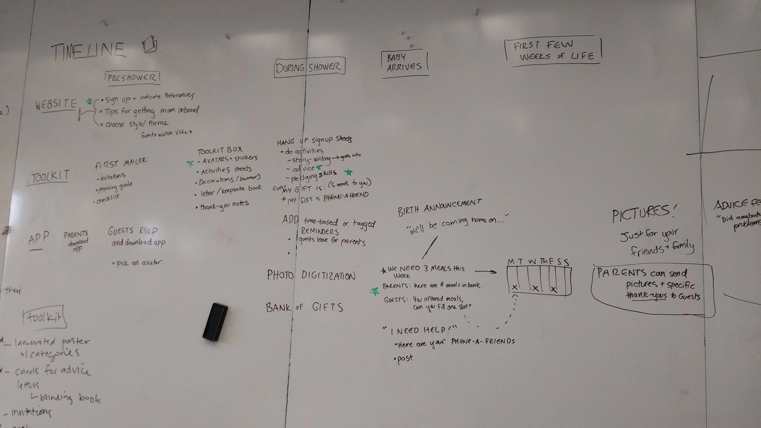
After co-sketching a timeline and defining use patterns, we landed on a baby shower toolkit with decorations, invitations, and a poster to pledge time and support at the shower that would make more traditional families happy coupled with an app to help keep track of all the "gifts" at the shower. We also considered advice cards and a website. To make the information architecture clear, we started wireframing the app. That allowed us to understand how we would need to design the calendar, keep track of pledges, and how people would RSVP. We printed and prototyped the poster to see how large the stickers would need to be and what should be on them.


Poster ITeration
Surprisingly, the poster was a difficult piece to come up with. It had to be customizable for many themes, simple to read, and orient users to putting the stickers on the poster the correct way. We went through several iterations before landing on the final design. For purposes of this theme, we chose craft paper and bunting as a theme that could realistically be chosen by someone.


Huddle Logo Iteration
The brand and the party theme had to be distinctly separate to hit the right note. The shower items could not feel "corporate" and the brand needed to feel warm and inviting.


App Iteration
We spent the most time iterating the app design since it is the quarterback of the system. The calendar system, the feed, clear feedback, and appropriately sized touch-targets were all considerations as we moved through designing the application. We left the website design fairly basic because it's primarily used for on-boarding and not a repeated touchpoint in the system. We used Google Material Design as a starting point for the medium-fidelity mock ups.


Looking to the Future
The process of creating Huddle was an adventure in an of itself. We began with many assumptions about what we might possibly make. We thought rent-the-runway for babies was in the cards for us, but research showed us that there is often a more interesting and more impactful root-cause of a problem. Evaluating and exploring different concepts allowed us to reframe the problem and look at it from a lens of changing practices rather than trying to slowly shift an existing paradigm. It was satisfying to meander through the research and come to a concept that felt solid and gave us a clear direction.
If we did it all again, we would love to be able to host a real huddle to test the concept with users. We would also do more evaluative testing of the app to see if people would actually be willing to download the app, and we would love to see how and with whom the concept would be adopted. We also envision this concept would be useful for weddings, children's birthday parties, and other life milestones that often come with too many material gifts.